Thursday, September 22, 2011

Rosaries: Fashion or Function?

Cardallegiance rosaries and rosary-style choker (center)
For some time now, rosaries have appeared around the necks of celebrities, fashionistas, and the average Jane or Joe on the street. This begs the question: "Are rosaries objects of fashion or objects with a function?"

Rosaries were created for a specific purpose, namely, to guide people in meditation on the life of Jesus (hence, the crucifix found at the bottom of a traditional rosary). The five sections of ten beads, known as decades, each represent a different event in the life of Christ and those who pray the rosary use its beads to aid in that meditation. For more information on how all this works, click here.

If you've read this far, you can guess where Cardallegiance stands on the "fashion vs. function" question. Although Cardallegiance sells handcrafted rosaries, the intent is for these objects to be used for their proper function-- prayer and meditation. As you can see in the picture at the start of this post, Cardallegiance also makes rosary-style necklaces. These pieces incorporate some visual elements like partitioned sections of beads, but the designs vary when it comes to how big sections are, what colors come into play, or what sort of drops or centerpieces are used.

Why is this important? I like to let customers know what they're buying. I also like when customers understand the design concept and why a particular piece was created. I've had conversations with some of you about card designs or jewelry pieces, so I know that you like a good story. This topic is also important because Cardallegiance wants to respect sacred objects--whatever their origin. It's important to note, though, that when jewelry and cards (of course!) are created, I may draw on many sources of inspiration. These muses can be religious or secular.

In a nutshell, the important thing to remember is that although fashion does rock, it can  and should be overruled  by ideals we hold more dear. 

Tuesday, August 2, 2011

Happy Birthday to... shoe!

Funky Fresh Birthday Card

Here it is-- your preview of the newest addition to the Cardallegiance family! The Funky Fresh holiday design proved so popular that I'm now introducing you to his fraternal twin-- Funky Fresh Birthday (FFB  for short). In comparison to her sibling, FFB is a little sleeker with a denim-like texture and some cool pops of aqua color. Her cupcake decal tells you she's ready to party while her graffiti-style script reveals an edgy, cosmopolitan side. Hipster to the core, FFB struts her multilingual stuff by wishing you a "Happy Birthday" in six languages-- English, Spanish, French, German, Vietnamese, and Amharic. *The transparent "Cardallegiance 2011" text will disappear in the final version, of course!*

Keep an eye out for FFB; she will soon appear among the selections at Cardallegiance's Etsy shop. You can also find Funky Fresh Birthday IRL (that's "in real life") at Van Ness-UDC's farmer's market from 10am to 1:30pm Saturdays in the District. Get more info on the market from these three hot spots: local radio station WPGC, live Twitter updates, and Farmers Market Online.

Tuesday, July 26, 2011

Inspiration....Yeah!!!

I'll keep this short and sweet-- I wish the summer heat would do the same! Inspiration rocks. It's what keeps me going. I've been delving more into jewelry crafting, using found objects (beads, filigree, etc) due to my new gig as a vendor at the Van Ness-UDC Farmer's Market in DC. Read a blurb about the June 2011 opening of the market here.

Since it's summer, one of my biggest inspirations is flora. You can see that reflected in my peony card and envelope design above. What can you expect next? Hydrangea, roses, and maybe some lillies, too. These are likely to appear in new jewelry designs like the one I've posted here. I expect flowers will translate in a more literal way than the design concept reflected in Lavender Aura....we'll see!

Monday, July 11, 2011

Light the Fire!


Yes, it's the middle of July. Yes, it's hot. No, that's not really the key inspiration for today's post. I created this design for some folks who recently received confirmation. If you've never heard of it and want the wiki "low down" on confirmation, click here. Otherwise, read on. Browsing this post should give you a general idea of my inspiration.

First, take another look at that pic above (you may want to click and enlarge it). Using my powers of creativity, I embedded some text right through that red heart. Look closely and you'll read the text-- knowledge, piety, fear of the Lord, counsel, fortitude, understanding , and wisdom. These are the seven gifts of the Holy Spirit bestowed on a person once he or she undergoes this spiritual rite of passage. The golden flames also incorporate some of the same wording.

My goal here was to create a bold, colorful, simple design. In the end, I think it works since it really expresses the meaning of the occasion-- starting a fire that will ultimately move a person to do good works in the world. Check out the Youtube vid of a song that was a "fire starter" for this design.

Friday, June 17, 2011

Junk Mail!


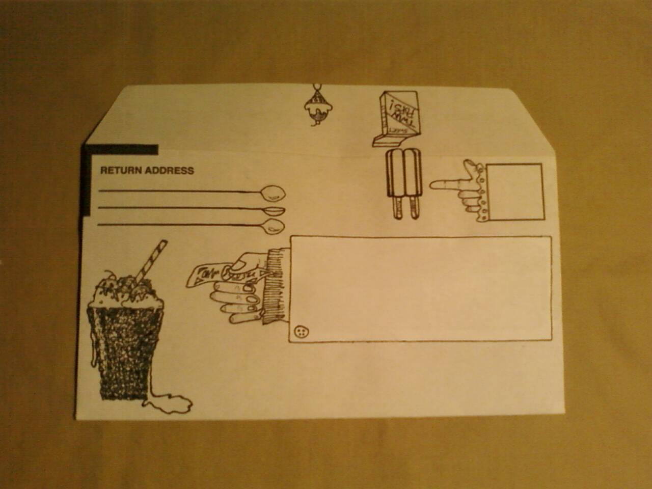
Yes, junk mail! As the saying goes, one person's trash is another person's treasure. When I receive junk mail, I usually toss it directly in the trash. I recently decided to break this trend and save some trees by converting these items into artful envelopes. Contrary to my usual design process,  I did no drafts or preliminary sketches for these concepts. I just let the lines and pre-printed text "speak" to me as each design took on a life of its own. (Give me a break-- I have to write like an "ar-TISTE" sometimes!). Now that I've given you a chunk of text and a preview above, here's the skinny on each design:

 
Design 1: Crazy Faces....because mail is tasty!

The "place postage here" box and the vertical lines on this business envelope inspired me to create toothy, crazy grins. I can't decide which is my favorite-- the postage-eating face (demanding postage be placed "here" in three languages) or the robot-looking face beneath the back flap. Overall, this design is my top pick of the whole collection...perhaps I was channeling masterpieces of Mesoamerican art when I created it.


Design 2: ICE CREAM!!


SCREAM for "Ice cream!" I know screaming for ice cream is cheesy, but I LOVED creating this design. Once again, I started with those vertical lines to the left of the postage box. Twin pops seemed like the natural way to go and boxes morphed into sleeves. Then the whole thing evolved into a delicious spread of ice creamery and quirky hands:

Random question: Can you balance an icecream cone on the tip of your index finger? If so, maybe you're a closet Globetrotter, or one of the Xmen with the weirdest mutant power ever. I could really buy into that kind of talent-- especially if it would score me bonus scoops of chocolate chip cookie dough, coffee, or mint chocolate chip....mmmmm

Design 3: Geometric


This was the first design I created for the series. I started with the "Business Reply" box and just went from there, playing around with darks and lights, tapered angles, etc. I feel like my eyes are paying tricks on me when I look at this sucker, and that's a good thing!

Design 4: Flora


Flora was the second envelope designed for the series. After doing something so straight-edged and geometric, I had to go back to nature and get organic. Again, I started with the "Business Reply" box. That started flowing into some crazy, hippie-looking vegetation and out came all the flowers, buds and vines. A strange garden grows here, but it looks like a nice cozy place for a letter to live.

Design 5: Baroque Frame


I thought of all things baroque when crafting this. What began with one little frame around the postage box (...starting with the postage box? Big surprise, I know:P) turned into a series of frames everywhere...and voila! Now I kind of wanna go all Lady Gaga, slap a handle on this baby and have it milled into a 3D object. Then I can hold the contraption up to my face whilst I go around looking through all the windows at people who will look back at me and think I'm crazy.

 Design 6: Music


 In the words of Rihanna, "Please don't stop the music!" This design was a fast one to whip up, and I know many people will identify with it as I do. Even if you don't read music, there's something really awesome about getting a letter wrapped in notation. Yes, I cheated a little with the address label because it's not quite finished. I was so excited about this design, though, that I decided to post it anyway. A note to the perfectionists: I'll probably update this post with a shot of the finished product when it's ready. Until then, enjoy the view.


I can't end this post without a shout-out to all the AWESOME FATHERS and FATHER FIGURES out there. I didn't do a Father's Day-specific card for this entry, however, any of these would do well for a guy who likes ice cream, music, or flowers (hey-- don't feed into stereotypes. Guys can like plants and baroque art, too!).

Many thanks to you real men for all you do to raise and support your kids and your grown-up kids.

Finally, if you like what you see here, email me and I'll hook you up with some recycled art. Option 2: visit these designs on Etsy. Go ahead. Recycled envelopes get lonely, too!

Tuesday, June 7, 2011

Shoes! ...Happy Holidays in June!

Holiday Shoe Card Set


Holiday Sneaker Card (a.k.a. Funky Fresh)
First, I must mention Liam Kyle Sullivan since his viral music video, "Shoes," is one reason I had footwear on the brain.The video won a People's Choice Award in 2008, however, I've decided not to post it here due its content and language. There's my obligatory warning for parents or others who might have concerns. I feel inclined to mention Sullivan's work, though, because I think it's important to acknowledge sources of inspiration.

 Aside from Sullivan's vid featuring a teenage shoe addict, I had other sources of inspiration. These included Steve Madden's gladiator wedges and I continue to reap inspiration from the design house of Alexander McQueen, which counted this floral wedge among the offerings in its Spring 2011 collection.  

Since I'm a fan of fashion, my fascination with outrageous shoes led to the creation of holiday shoe cards. I realize the holidays are long gone, but I love these designs so much and they were begging for their own post!

This collection includes four fab, feminine styles (a.k.a. Green Velvet, Peppermint, Holiday Classic, and Gingerbread) plus a more casual athletic shoe design (Funky Fresh) The textures and lettered detailing were a blast to create. I guess that means Funky Fresh  is my favorite design (though I usually hate to pick favorites!).

Green Velvet and Peppermint

Holiday Classic and Gingerbread

Inside View

Funky Fresh

Funky Fresh: ready for his close-up!


Which is your favorite? Can't decide? See the whole set on Etsy.

Here's to fabulously clad footsies! Deuces!

Tuesday, May 31, 2011

Happy Birthday!

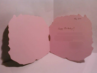
Here's to a birthday full of peonies and sea dreams! With so many spring birthdays, I had a blast surprising some people. To that end, I'm fortunate enough to have awesome friends who deserve equally awesome birthday gifts:

"Happy Birthday" Peony Card


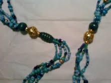
"Sea Dreams" endless necklace


What was my inspiration? Spring-- the season of flowers and newness. Warm, summer-like weather has also made me think about vacations, beaches, and sea life. That's where these two fab designs came from.


Let me answer a few questions you're surely thinking: "Why are you posting jewelry? Isn't this a blog about cards?" The answers to these questions are

  • (a) Jewelry rocks (pun intended). It deserves some blog time.
  • (b) This is a blog about cards, and yet this blog isn't exclusively about cards.

Obviously, "Cardallegiance" refers to cards. However, you'll find, dear readers, that I tend to get creative in a variety of ways. Jewelry crafting-- which for me includes beading and metalworking-- is also a passion of mine. So this birthday post gives you a sampling of card and gift ideas inspired by the spring/summer seasons.

To that end, I'm giving a great big shout-out to spring gardens and L'Occitane.

The backstory- On recent outings, I encountered these large, gorgeous peonies budding and in full bloom. Then I noticed the fabulous work produced by L'Occitane for the new "Pivoine Flora Fragrance Collection" :


L'Occitane's Pivoine Fragrance

How inspiring is that? I just had to create something reflecting peonies. Here are more shots of the finished product:


What's so cool about this design? Of course, it's based on nature's handiwork. Secondly, the envelope is recycled. I used an old flyer to craft the minty green card holder. Note the plaid detailing on the inside. You can even see original text on the document. I didn't bother to cover up all those rows of numbers since they added so nicely to the design. The outside print comes from my sketch of a peony bud. So precious!

Now for the jewelry. This "endless necklace" has no clasp, but it's meant to be worn long or layered (the full length of this baby is about 25.5 inches).


The composition is mostly seed beads in blue, green, and gold hues with a few accent beads (metallic and wood) thrown in. My friend was thrilled with her gift and coincidentally, it matched the vibrant turquoise dress she was wearing. Total awesomeness!


So, there you have it. Happy Born Day, readers!