
Yes, junk mail! As the saying goes, one person's trash is another person's treasure. When I receive junk mail, I usually toss it directly in the trash. I recently decided to break this trend and save some trees by converting these items into artful envelopes. Contrary to my usual design process, I did no drafts or preliminary sketches for these concepts. I just let the lines and pre-printed text "speak" to me as each design took on a life of its own. (Give me a break-- I have to write like an "ar-TISTE" sometimes!). Now that I've given you a chunk of text and a preview above, here's the skinny on each design:
Design 1: Crazy Faces....because mail is tasty!


Design 2: ICE CREAM!!
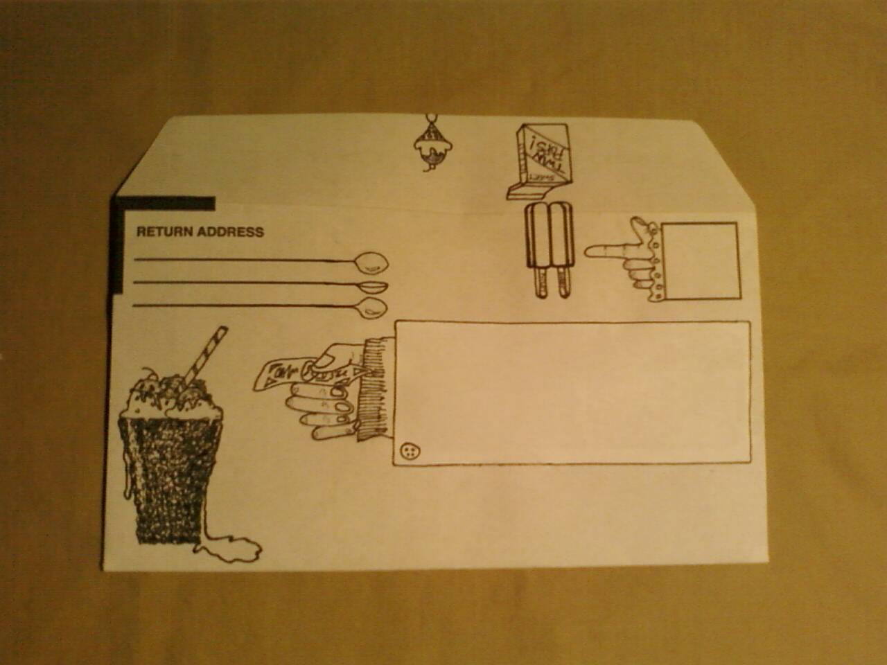
SCREAM for "Ice cream!" I know screaming for ice cream is cheesy, but I LOVED creating this design. Once again, I started with those vertical lines to the left of the postage box. Twin pops seemed like the natural way to go and boxes morphed into sleeves. Then the whole thing evolved into a delicious spread of ice creamery and quirky hands:


Design 3: Geometric

This was the first design I created for the series. I started with the "Business Reply" box and just went from there, playing around with darks and lights, tapered angles, etc. I feel like my eyes are paying tricks on me when I look at this sucker, and that's a good thing!
Design 4: Flora

Design 5: Baroque Frame

I thought of all things baroque when crafting this. What began with one little frame around the postage box (...starting with the postage box? Big surprise, I know:P) turned into a series of frames everywhere...and voila! Now I kind of wanna go all Lady Gaga, slap a handle on this baby and have it milled into a 3D object. Then I can hold the contraption up to my face whilst I go around looking through all the windows at people who will look back at me and think I'm crazy.
Design 6: Music

In the words of Rihanna, "Please don't stop the music!" This design was a fast one to whip up, and I know many people will identify with it as I do. Even if you don't read music, there's something really awesome about getting a letter wrapped in notation. Yes, I cheated a little with the address label because it's not quite finished. I was so excited about this design, though, that I decided to post it anyway. A note to the perfectionists: I'll probably update this post with a shot of the finished product when it's ready. Until then, enjoy the view.
I can't end this post without a shout-out to all the AWESOME FATHERS and FATHER FIGURES out there. I didn't do a Father's Day-specific card for this entry, however, any of these would do well for a guy who likes ice cream, music, or flowers (hey-- don't feed into stereotypes. Guys can like plants and baroque art, too!).
Many thanks to you real men for all you do to raise and support your kids and your grown-up kids.
Finally, if you like what you see here, email me and I'll hook you up with some recycled art. Option 2: visit these designs on Etsy. Go ahead. Recycled envelopes get lonely, too!


